2 ½ Mile Cafe in Check Post, Siliguri, is a renowned gathering place for all ages. With a warm ambiance & comfortable seating options, it’s the ideal spot for relaxation and socialising where you can enjoy an extensive menu featuring a wide range of coffee and savoury dishes.
As 2 1/2 is a popular location in Siliguri, we got the logo inspired from the same and used the milestone icon for it and created the logo for Dhai Mile.
Yatee is a luxury fashion brand specializing in Indian and Indo-Western attire, where tradition meets contemporary elegance. Every piece is crafted to exude sophistication, cultural richness, and timeless beauty.
The logo was meticulously designed to reflect the essence of Yatee, a name that symbolizes Maa Durga. Rather than being just a visual identity, it tells a story—a fusion of power and poise, divinity and design. The red tikka at the center represents strength and auspiciousness, while the arched eyebrows and eye shape of Maa Durga subtly weave in elements of vision, grace, and femininity. These details are not just aesthetic choices; they embody the soul of Yatee’s fashion—bold, empowering, and deeply rooted in tradition.
The Prime Developers logo reflects trust, growth, and refined living. Clean lines and balanced geometry symbolize strong foundations and thoughtful planning. Subtle accents highlight exclusivity without excess.
The design mirrors Prime Developers’ promise of well-planned spaces that feel secure, elegant, and truly aspirational homes.
Spanning 40,000 sq. ft. across three floors, Domus Decore is a luxury showroom showcasing the finest tiles, bath fittings, wellness products, modular kitchens, and system aluminum windows. Designed to blend innovation with elegance, it redefines modern living.
The logo was crafted with precision, reflecting the brand’s sleek, cutting-edge identity. Inspired by Vaastu principles, it embodies balance, direction, and harmony, while the sharp edges symbolize the refined craftsmanship of premium tiles. A fusion of design, luxury, and innovation, the logo stands as a testament to Domus Decore’s commitment to excellence.
Bee You is a men’s clothing brand designed for those who embrace their unique style with confidence. Offering a blend of modern fashion and timeless elegance, it’s all about dressing the way you truly are.
The logo was thoughtfully crafted to reflect the brand’s essence—bold, stylish, and authentic. Inspired by the name, it symbolizes individuality and self-expression, making Bee You more than just a brand—it’s a statement.
FOI, Flavours of India is a brand that specializes in providing customers with a wide range of Indian snacks. Launched in 2022, it has over 150 different types of snacks available. It offers a unique and diverse selection of Indian flavours, all over the nation.
For FOI, we went for quirky and fun elements like moustache and fab signs representing India in an amusing way.
Launched in 2025, Shivam Marbles is a 6000 sq. ft. showroom housing an extensive collection of 4000+ varieties of tiles and granites, including premium selections imported from across the globe. With an unwavering commitment to quality and design, they confidently offer one of the widest and finest selections in the industry.
The logo was meticulously crafted to reflect the brand’s strength, ambition, and divine inspiration. Incorporating elements of Lord Shiva’s third eye, it signifies power, vision, and transformation, mirroring the bold and dynamic nature of Shivam Marbles. The initials S & M are seamlessly integrated, representing the brand’s solid foundation and forward-thinking approach.
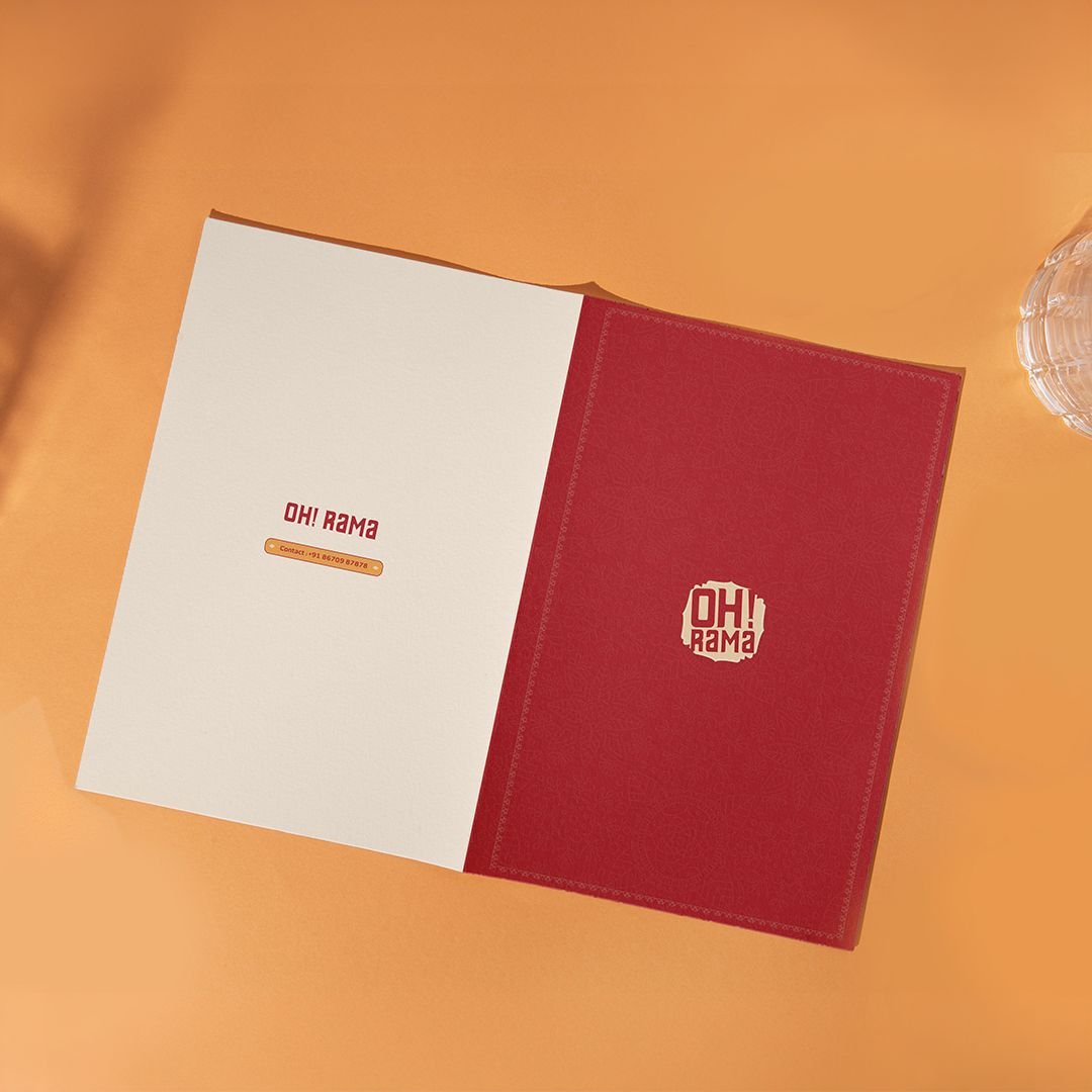
Oh! Rama is a vegetarian bistro crafted for those who love indulging in comfort food after a good adda launched in 2025. Blending traditional Indian flavors with a modern, convenient dining experience, Oh Rama is where nostalgia meets innovation on every plate.
From logo to branding and even packaging, we have shaped the entire identity of Oh Rama. The logo’s traditional design reflects the warmth of Indian cuisine, while the modern fonts represent innovation and a relaxed, easygoing ambiance, just like the experience we aim to create!
A leading force in Nepali cinema, Yashoda Films, established by Nitesh Malpani, is renowned for producing high-quality Nepali films. Their impressive portfolio includes “Phulbari,” featuring esteemed actors Bipin Karki, Dayahang Rai, Aruna Karki, and others.
As it is a production house, we created their logo with icons like play & pause. Eventually turning these icons to a camera.
Lorem ipsum dolor sit amet, consectetur adipiscing elit. Sed do eiusmod tempor incididunt ut labore et dolore magna aliqua. Ut enim ad minim veniam, quis nostrud exercitation ullamco laboris nisi ut aliquip ex ea commodo consequat. Duis aute irure dolor in reprehenderit in voluptate velit esse cillum dolore eu fugiat nulla pariatur.
Excepteur sint occaecat cupidatat non proident, sunt in culpa qui officia deserunt mollit anim id est laborum. Curabitur non nulla sit amet nisl tempus convallis quis ac lectus. Vivamus suscipit tortor eget felis porttitor volutpat, sed porttitor lectus nibh.
Paras Royale is a boutique residential property featuring 20 exquisitely designed 3 & 4 BHK flats in a prime location of Siliguri. Developed by Prime Developers, the creators of landmark projects like Premiere Town, Prime Luxe, and Prime Diamante, Paras Royale is a testament to refined living and architectural excellence.
To reflect the property’s luxury and exclusivity, we meticulously designed the Paras Royale logo with an elegant and timeless approach. The carefully chosen sophisticated typography embodies grandeur and class, while the distinctive ‘O’ in Royale was crafted to symbolize the close-knit, harmonious community that residents will experience. Every detail in the design was thoughtfully curated to capture the essence of premium living, elegance, and a sense of belonging—making Paras Royale not just a residence, but a prestigious address.
BDS Eternia, in eastern bypass is a testament to modern living, offers thoughtfully designed residences that blend elegance with innovation. With a commitment to quality and future-ready living, it provides a lifestyle that stands the test of time.
The logo was meticulously crafted to reflect the essence of “Eternia.” The infinity symbol represents eternity, signifying a home designed for lasting comfort and value. The plus sign embodies growth and progress, highlighting features that set BDS Eternia apart as a space ahead of its time.
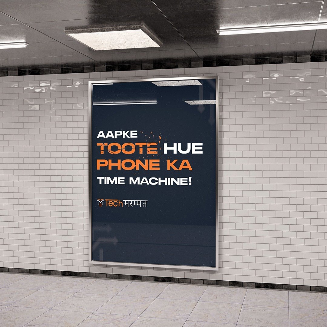
Launched in 2023, Tech Marammat is a tech-savvy brand specializing in mobile phone and gadget repairs of all kinds. With cutting-edge solutions and expert service, they ensure that your devices are back in action with precision and care.
To bring their vision to life, we designed the Tech Marammat logo, blending technology, efficiency, and approachability into a single, impactful identity. The logo integrates sleek, modern elements to represent speed and precision, while its bold, playful typography reflects the brand’s accessible and customer-friendly approach. Subtle circuit-like patterns and futuristic accents emphasize their expertise in repairs, making the design truly resonate with the brand’s high-tech and innovative nature.
World of Sports is a multi-sports arena and academy, where kids and sports lovers can learn, train, and grow in their favorite games. Whether for fun or as a career, it’s the perfect place to pursue your passion for sports with expert coaching and great facilities.
The logo is designed to look sporty and full of energy, with an oval shape representing the arena. It captures the spirit of the game and the excitement of playing and learning in a world dedicated to sports.
Dastaan is an event production company that believes every event holds a unique story waiting to be told. From concept to execution, they help create and organize unforgettable experiences that people can cherish forever. Whether it’s a grand celebration or an intimate gathering, they turn moments into lasting memories.
From branding to design, they have shaped the identity of Dastaan. The visiting card was designed to reflect the essence of the brand, capturing its belief in storytelling and the magic of every event. Go with the flow, live the tale, and gather memories worth celebrating!
Oh! Rama is a vegetarian bistro crafted for those who love indulging in comfort food after a good adda launched in 2025. Blending traditional Indian flavors with a modern, convenient dining experience, Oh Rama is where nostalgia meets innovation on every plate.
From logo to branding and even packaging, we have shaped the entire identity of Oh Rama. The logo’s traditional design reflects the warmth of Indian cuisine, while the modern fonts represent innovation and a relaxed, easygoing ambiance, just like the experience we aim to create!
With 40 years of excellence, Harish Estates is a trusted name in North Bengal’s real estate sector, known for prime locations, superior construction, modern amenities, and reasonable pricing. Dedicated to shaping exceptional living spaces, the company has been delivering quality infrastructure for decades and continues its commitment to building homes that stand the test of time.
The logo embodies the essence of real estate, featuring elements inspired by architectural structures to reflect strength and reliability. The golden color symbolizes luxury, trust, and timeless elegance, reinforcing Harish Estates’ vision of excellence in every project.
A unit of Colour Suraksha, Supernova is an upcoming roofing sheet brand set to redefine strength, style, and durability. Built on innovation and quality, it offers a wide range of vibrant color options, ensuring both protection and aesthetics for modern structures.
The logo is a fusion of creativity and purpose, designed to reflect the diverse color choices available in roofing sheets. Every element embodies Supernova’s commitment to next-gen roofing solutions, combining style, durability, and innovation under one trusted name.
Suncity, a project by Harish Estates, offers 1, 2, 3 and 4 BHK apartments for various budgets. Conveniently prime located on Medical More, Siliguri, it offers close proximity to hospitals, institutes, banks, hotels, and entertainment options and it ensures a comfortable and enriching lifestyle with modern amenities.
For any property, it’s very important to get sunlight in all the flats. Therefore, we added the elements of sun and a window that suggests the welcoming of the sun rays inside every flat of the property.
Harish Estates’ Nirvana project features thoughtfully designed 3 and 4-bedroom residences. The building prioritises eco-friendly construction and boasts a prime location at Over Bridge, near ICAI Bhawan, Siliguri, making it the perfect place to reside.
Each one imagines their home to be in greenery and peace. Inspired by the same, Nirvana’s logo was made to look secure and serene.
Ananda by Harish Estates, is an apartment complex which offers thoughtfully designed Vaastu-compliant 3 & 4 BHK apartments in an eco-friendly complex near Sevoke Road Siliguri, with modern amenities.
Derived from the word Ananda, we kept the logo of Ananda reflecting peace in a home.
Ananda by Harish Estates, is an apartment complex which offers thoughtfully designed Vaastu-compliant 3 & 4 BHK apartments in an eco-friendly complex near Sevoke Road Siliguri, with modern amenities.
Derived from the word Ananda, we kept the logo of Ananda reflecting peace in a home.
Inch Imagine, a furnishing showroom in Siliguri, elevates homes by providing a wide range of furnishings that prioritise both style and comfort. They offer a comprehensive range of services, including revamps, home decor consultations, and customised wallpaper solutions.
Inculcating the blackout curtain & blind’s elements, Inchimagine’s logo was created keeping in mind the class it had to portray and minimalism.
The North Bengal Healthcare Summit logo reflects the coming together of healthcare and technology. A modern medical cross formed with digital lines represents innovation, connectivity, and progress in the healthcare sector.
Clean typography and calming blue tones convey trust, care, and credibility, marking a meaningful milestone in ICC North Bengal Chapter’s centenary year.
Headed by Adi Agarwal, Polymummy is a new hospital slated to open in Siliguri, West Bengal. Leveraging its experience as a leading healthcare provider in Sikkim, particularly in wholesale medical supplies, Polymummy aims to extend its exceptional service standards and expertise to the Siliguri community with this hospital.
Warmth, security and love was what we wanted to express through this logo. With icons of heart, mother and child, and medical sign, we made this logo that touched people at their core.
The Paradise logo is carefully built around meaningful elements. The two upward-flowing leaf forms represent growth, progress, and a connection to nature. Teal reflects trust and calm, while green signifies freshness and harmony.
Clean, balanced typography adds clarity and stability, bringing together emotion and structure in a logo that feels peaceful, grounded, and timeless.
Aqua Tuff is a Siliguri based shower enclosure company. With premium products, it is a well known and reputed brand trusted by people in and around Siliguri!
Since it is a shower enclosure company, we added the blue colours with the icons of water. Making it according to the client’s representation, we added our creativity to make the logo stand out in the crowd!
GKG Jewels, now a proud Tanishq franchise, brings you the finest collection of exquisite jewellery, blending luxury with craftsmanship. With a commitment to quality and elegance, it offers timeless designs for every occasion.
The logo was carefully designed using luxurious and elegant fonts, mirroring the grace and sophistication of its jewellery. Just like its designs, the logo reflects refinement, tradition, and modern elegance, making GKG Jewels a symbol of trust and beauty.
Robo Foods is revolutionizing processed foods, making cooking faster, easier, and more efficient while reducing food waste. Designed to be a chef’s best friend, it helps kitchens save time without compromising on quality.
The logo captures the brand’s innovation, featuring robotic eyes to represent speed and precision—just like a robot in the kitchen. The bold, playful fonts add a touch of uniqueness, reflecting how Robo Foods simplifies cooking by 70%, making it the future of smart food solutions.
Aamaa is a rice brand rooted in the hills of Sikkim. The idea was simple yet heartfelt: to give every consumer a homely touch with every purchase. The name Aamaa carries a sense of warmth and familiarity, feelings we all instinctively understand.
With these emotions in mind, the logo was designed to quietly echo comfort, belonging, and home. Each grain delivers not just quality rice, but a gentle reminder of traditions that feel close to the heart.
Sunita Stone Gravels Private Limited is a renowned name in Siliguri and nearby areas, known for its excellence in stone crushing and fly ash brick manufacturing. With state-of-the-art machinery, they ensure superior quality and durability, making them a trusted choice for construction needs.
To honor their legacy while embracing modernity, we recreated their old logo, giving it a refreshed yet familiar identity. The new design reflects their strength, reliability, and commitment to quality, ensuring they continue to stand tall in the industry. Built to last, designed for the future!
The 360 East Zen logo reflects calm, balance, and premium living. Inspired by a symmetrical mandala, it represents harmony and completeness from every direction.
The golden tone adds a sense of luxury, while bold, clean typography conveys strength and trust – capturing the essence of serene, well-planned residential living by Hillman Group.
The Prime Paradise logo is designed keeping the essence of its name at the core. The modern floral formation reflects harmony, growth, and balance.
A minimal yet refined design adds a subtle touch of luxury, while the clean structure represents comfort, stability, and thoughtfully planned residential living.
Manokamana is a Siliguri-based brand offering a variety of chips and fryums for everyone who loves a crispy, flavorful bite. With a focus on taste and quality, Manokamana aims to bring fun and crunch to every snack time!
We designed the logo and packaging, ensuring it reflects the brand’s playful and flavorful identity. By using vibrant colors and eye-catching elements, we created a design that stands out on shelves and makes Manokamana a brand to watch in the snack world!
Rajhans is a brand committed to delivering the finest quality maida, choker, and suji, blending tradition with excellence. The logo beautifully captures the essence of the brand, integrating a swan (Hans), symbolizing purity and grace, with a wheat pod seamlessly attached to its wings. This thoughtful design reflects the perfect harmony between the brand name and its core product, reinforcing Rajhans’ commitment to quality, tradition, and trust.
Rajhans is a brand committed to delivering the finest quality maida, choker, and suji, blending tradition with excellence. The logo beautifully captures the essence of the brand, integrating a swan (Hans), symbolizing purity and grace, with a wheat pod seamlessly attached to its wings. This thoughtful design reflects the perfect harmony between the brand name and its core product, reinforcing Rajhans’ commitment to quality, tradition, and trust.
We built the website for PRM Group, one of Eastern India’s trusted real estate developers. The design focuses on elegance and simplicity – reflecting the luxury spaces they’re known for. From showcasing their residential and commercial projects to making enquiries seamless, the site brings everything together in a clean, effortless experience.
The MLA Group website was designed as a clear corporate profile that explains their business at a glance. From the first visit, users understand what MLA Group does, their expertise, and the scale of their work. The design includes strong creative elements inspired by the projects they build, maintaining a professional and credible brand presence.
We developed the official website for Panchnai Group with a focus on clarity, accessibility, and seamless navigation. The design ensures users can easily explore projects and company information. Every detail—from layout to structure—has been thoughtfully planned to offer a smooth experience, keeping the needs of the target audience in mind.
We built the Colour Suraksha website to reflect the brand’s promise of protection with personality. The site is vibrant, visually engaging, and easy to navigate—with product details, applications, and dealer info just a click away. We kept the aesthetics bold yet clean, ensuring a smooth experience across all devices.
When we designed The Furnishing Story website, the intent was to keep it simple, informative, and to the point. The website was built to ensure that anyone who visits instantly understands the brand, its offerings, and its values, without unnecessary distractions.
Crafted with clarity in mind, the BLG Group website follows a minimal and structured approach. The layout is clean, the flow intuitive, and every section is designed to guide users effortlessly. Subtle design choices keep the focus on content, making the overall experience simple, organised, and easy to navigate.
We created a product-centric, multi-page website for Radha Trading Company — a JSW Colour Roofing Sheets & MS Truss distributor. The goal was clarity from the first glance, so the roofing focus is instantly recognizable. With a clean layout and easy navigation, the site ensures a smooth experience for its target users.
The MK Group website was built to mirror the brand’s strong foothold in real estate and infrastructure. From sleek UI to a clear content flow, every element was designed with purpose. Strong, consistent branding tied it all together—elevating the digital presence and adding a layer of trust and professionalism.
Lorem ipsum dolor sit amet, consectetur adipiscing elit. Vivamus lacinia ligula nec augue tempus, ac faucibus turpis tincidunt. Nulla facilisi. Sed euismod felis ac tortor varius, sed dapibus purus tincidunt. Donec maximus leo nec orci ullamcorper, et condimentum ipsum sollicitudin.
Cras aliquam auctor augue, non convallis metus efficitur id. Morbi euismod, felis in fermentum luctus, lectus turpis volutpat erat, id tincidunt felis odio ut purus. Sed tristique orci vel lorem varius, et laoreet purus tincidunt. Etiam vitae convallis purus.
Blending heritage with modern comfort, Barsana Boutique Hotel offers spacious rooms and 24-hour service in the heart of Kolkata—Topsia. Whether you choose to host events in their Advaya hall or savour vegetarian delights at their Bahula restaurant – Barsana caters to all your needs.
Link: https://www.instagram.com/barsanahotelkolkata?igsh=MmgwcjRnZzFmNWlj
Social Media pages was managed from the very start, keeping in mind- Grid aesthetics, Glamour, Richness
For BDS Eternia, a project envisioned to stand the test of time, the brochure was designed to reflect the concept of infinity—both in form and idea. Built around the theme “Infinite. Perfect. Yours.”, every element of the brochure reinforces the timeless identity of the brand.
The design language played with dualities—hard & soft, aesthetic & scientific, work & play—to showcase how BDS Eternia is a forward-thinking development that balances every facet of modern living. From typography to layout, even a single torn page would unmistakably reflect the branding of BDS Eternia.
This brochure is not just visually striking, but strategically built to communicate permanence, depth, and futuristic thinking—making it as enduring as the project it represents.
For Revanta 82, a thoughtfully developed luxury residential project located at Jyotinagar, we crafted a brochure that reflects the same level of attention to detail and refined taste that defines the property itself.
From the very beginning, our focus was to translate the project’s essence—balancing essential living comforts with elevated luxury—into a visual and tactile experience. The brochure was conceptualized to evoke exclusivity and sophistication, with every design decision rooted in that vision.
Typography played a key role; we carefully selected fonts that convey elegance and premiumness without overpowering the overall minimal aesthetic. The layout was clean yet rich, allowing the architecture and amenities of Revanta 82 to take center stage. Every page was designed to flow seamlessly, offering readers an immersive journey through the project’s highlights.
Designed for Panchnai Sanskritam, this brochure blends traditional aesthetics with modern minimalism. The generous use of white space not only enhances elegance but subtly represents the project’s open-from-all-sides layout and serene surroundings.
Every design element—from the refined typography to the cultural motifs—was carefully chosen to reflect both the heritage and the forward-looking vision of the development. The layout maintains strong brand consistency while offering a visually calm and composed reading experience.
The result is a brochure that’s graceful, balanced, and rooted in tradition—while appealing to the sensibilities of the modern homebuyer.
As the name suggests, Prime Paradise is reflected through a brochure crafted with a creative and artistic approach. With limited pages to work with, every detail was designed to be informative, purposeful, and aligned with the project’s branding.
As the name suggests, Prime Paradise is reflected through a brochure crafted with a creative and artistic approach. With limited pages to work with, every detail was designed to be informative, purposeful, and aligned with the project’s branding.
Crafted for Paras Royale, a boutique residential project, this brochure was built around the theme “Built for Few, Built for You.” The design reflects a sense of exclusivity and a close-knit community, just like the project itself.
A vibrant color palette brings life and warmth to every page, making the brochure visually inviting. Modern, sharp-edged fonts add a contemporary edge, offering a fresh take on premium living.
From layout to typography, every detail was thoughtfully chosen to mirror the project’s intimate, community-first identity—making the brochure both engaging and memorable.
The brochure for Robo Foods was crafted to be both engaging and informative—introducing the business venture while showcasing its diverse range of food offerings. The design focuses on delivering clear information in a format that’s easy to navigate and visually appealing.
With vibrant colors, bold typography, and playful design elements, the brochure instantly grabs attention and reflects the energetic personality of the brand. Each page was thoughtfully laid out to strike a balance between fun and function.
The result is a brochure that not only informs but delights—making it as memorable as the food it represents.
The brochure for Sacred Heart School was designed to reflect the school’s core values of learning, exploration, growth, discipline, and creativity. A thoughtful blend of formal structure and playful design elements helped us capture the holistic educational environment the school offers.
Photographs of real students were used throughout the brochure to convey authenticity and highlight the dynamic learning curve of the institution. From classrooms to co-curricular activities, every section was crafted to showcase the school’s diverse offerings and nurturing spirit.
With a clean, engaging layout and educationally inspired design elements, the brochure effectively communicates the vibrant academic and developmental journey that awaits each student at Sacred Heart.
The business profile for Kamac Engineers Private Limited was designed with a focus on professionalism, clarity, and strength. Every design element- from the choice of fonts to the layout- was carefully selected to reflect the company’s engineering expertise and solid reputation. Clean visuals, bold typography, and structured formatting were used to communicate reliability and precision, while maintaining a modern, business-forward aesthetic that aligns with Kamac’s core values and industry presence.
The business profile for Kamac Engineers Private Limited was designed with a focus on professionalism, clarity, and strength. Every design element- from the choice of fonts to the layout- was carefully selected to reflect the company’s engineering expertise and solid reputation. Clean visuals, bold typography, and structured formatting were used to communicate reliability and precision, while maintaining a modern, business-forward aesthetic that aligns with Kamac’s core values and industry presence.
Lorem ipsum dolor sit amet, consectetur adipiscing elit. Vivamus lacinia ligula nec augue tempus, ac faucibus turpis tincidunt. Nulla facilisi. Sed euismod felis ac tortor varius, sed dapibus purus tincidunt. Donec maximus leo nec orci ullamcorper, et condimentum ipsum sollicitudin.
Cras aliquam auctor augue, non convallis metus efficitur id. Morbi euismod, felis in fermentum luctus, lectus turpis volutpat erat, id tincidunt felis odio ut purus. Sed tristique orci vel lorem varius, et laoreet purus tincidunt. Etiam vitae convallis purus.